
Pedaling across the world.
This project was done while at Catch New York. Catch New York was ofo's U.S. marketing agency. The team members who contributed to this project worked at Catch New York at the time of launch.
25 million bike rides a day. If you were to narrow that number down and put it into perspective for only one city, that would be the equivalent of 1.6 bike rides a day for every person living in Istanbul, 1.1 bike rides for every inhabitant of Sao Paulo, and nearly three rides a day per NYC-citizen. And at the height of the ofo's global dominance, that's how many customers serviced per day.
This is how ofo.com was built for customers in over 20 markets and languages.
A company that changed the way we traveled.
ofo was China's, and the world's, largest bike-sharing company. If you've ever visited China, you're more than likely to have seen or ridden the vibrant, yellow ofo bikes. At its broadest, ofo operated in over 200 cities globally, had more than 62 million active users, and was valued at $2 billion.
Our story began when ofo decided to expand to the U.S. to become the staple bike-sharing company across American cities and universities.
The first date.
The first meeting with ofo was in NYC at Catch New York's office, where the team sat with members of ofo's U.S. operations. A crash course on their expansion goals, operations, the benefits of dockless bike-sharing, and their target markets was necessary before fully jumping into the product. Questions about their business, user base, and competition were answered to give a baseline to work off, and it was apparent from that meeting that the scope of this project had to be extremely focused, yet flexible for the areas out of our couldn't control.
Because the market was a land grab, ofo's needs changed rapidly to market demands. One day they were expanding to Miami and the next day to Denver. Lobbying and negotiations with city officials altered where they were to launch, and where we needed to focus our attention.
The target markets.
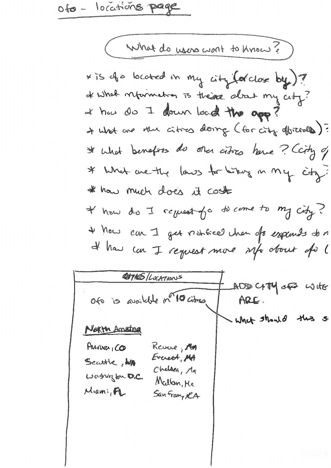
ofo targeted three primary customer segments: 1. The riders (consumers), 2. City/Government officials, and 3. University officials. We needed to drill into these target segments to discover what information each sought out when choosing a bike-sharing company. To accomplish this, we conducted an intensive research phase crammed into a few days. We buried ourselves in published studies about cities of the future and learned about the goals officials had set for their cities and the struggles they faced trying to create more sustainable cities.
- What were the benefits of dockless bike-sharing (i.e., ofo's model) vs. the docked models (i.e., CitiBike in NYC)?
- Why were city and university officials be interested in a dockless system?
- What were the pain points of bike-sharing?
Answering those questions, let us understand how to speak to different segments.
We quickly transferred this knowledge into sketches and proposed the following content sections for all three target markets.


The status quo.
If you looked at the other bike-sharing sites, there was a lack of tailored and targeted information. They seemed to all copy each other, and we placed a lot of emphasis on making sure we did not fall into this trap.
We decided that the main navigation should speak directly to the three target markets, so we made the navigation items: for riders, for cities, and for campuses, making it very easy for each segment to understand the product, benefits, and start a conversation with ofo.
Creating a dialog.
At this point, we figured out the initial I.A., but we still asked ourselves how we could create a dialog with someone about a service that is not operational yet? This was significant because when the site launched, ofo was yet to launch in a U.S. city.
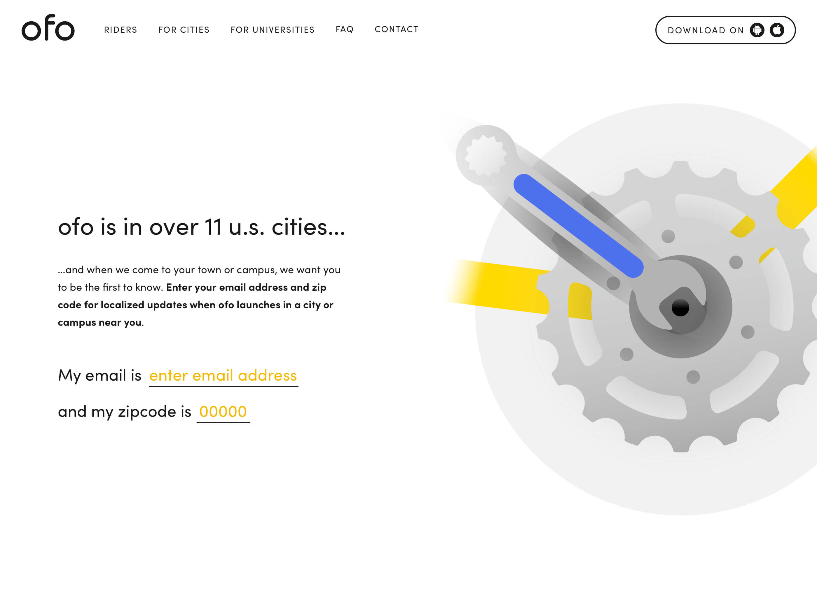
City and university officials were able to contact ofo directly as the legal process was conducted offline, but for riders, we wanted to avoid having them download an app they couldn't use and would ultimately abandon.
We solved this by creating an experience that captured consumers' interest in bringing ofo to their cities. Adding this page to the site addressed two issues, it captured potential leads, and it measured which cities they needed to look expanding to. We only asked consumers to enter a zip code and email address where we could notify them when ofo was launching in their city.


Design.
Designing ofo.com started from day one. The same day we began to research the target markets, our design team became familiar with ofo's brand guidelines and ideated ways to visually differentiate ofo in the U.S. market. We knew the design had to be unique and different from any other bike-sharing company.
Designing ofo.com started from day one. The same day we began to research the target markets, our design team became familiar with ofo's brand guidelines and ideated ways to visually differentiate ofo in the U.S. market. We knew the design had to be unique and different from any other bike-sharing company.


The final layer of the design was to add motion. We used components of a bicycle as inspiration and focused on mimicking the bike wheel. So, we built a custom function that on scroll moved elements at different but controlled speeds, and on scroll-off, it gradually ended the motion without coming to an abrupt stop, leading to an overall smoother scroll experience.
Development.
The idea that we had to build this site for scale was present through every step of the process. From the architecture to the design system to engineering, we knew this site had the opportunity to grow beyond the U.S. market to handle many languages and regions. With future internationalization and localization needs in mind, it was built as a single-page app using React with Redux for view-templates, maximizing flow and speed once a user entered the site. Our layout took into account the possibility that multiple languages would be added to the site, with different reading directions.
From day one to launch, the process was intense but seamless. Setting a structure from day one was instrumental in successfully launching a website where everyone was happy. During the project, there were many healthy disagreements that only positively contributed to its success.
From one to 25.
ofo's rapid growth into new markets shed light on some of the operational problems of scaling a website. As mentioned earlier, ofo created a website per market, and that took on different top-level domain names. This wasn't sustainable, and it became evident to them that they needed one site with the flexibility to work across all locations.
ofo decided to unify all their websites into one, and the U.S. website was chosen as the new global website. It wasn't as easy as flipping a switch. We had to coordinate with local ofo marketing teams to gather assets, translations, feature requests, and more. We also had to adjust the layout for certain countries that unique rules and regulations. For instance, the U.K. makes left turns on red while the U.S. makes right turns on red. Although a rather small detail, we needed to make sure that the local markets could update the assets and copy. We developed a custom CMS that any ofo team member with the correct user role would be able to log in and change content for their location.

Reflections.
The experience of dealing with different cultures and opinions across multiple time zones was terrific. We encountered lots of pushback on several areas of the design, especially regarding the curved shapes and illustrations. We knew our design vision was the correct choice for ofo, and we were able to compromise on some aspects while staying true to our instincts and pushing back where it mattered most. We created a site that differentiated ofo from the rest of the competition and set them up for long-term success.